teamworks communication
ADHD Coaching
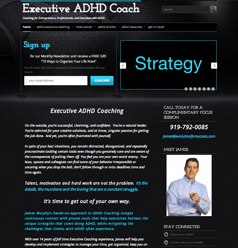
This website was created from the ground up as an off shoot from the Executive Coaching website. The goal of this project was to create a very clean and masculine site to zero in on the business owner’s target market.
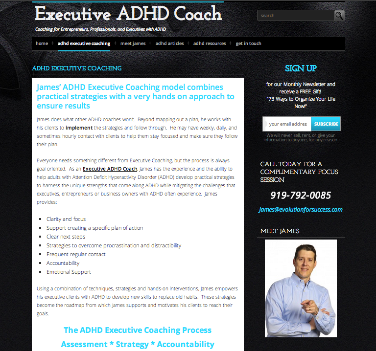
Although, it is a small commercial website in terms of pages, it presents a number of interesting features. Images were kept to a minimum to eliminate distractions and a lot of attention was put on the marketing copy. The Home page is widgetized, and provides a glimpse of different articles with a featured article. The slider features a power point presentation. Colors and typography were customized. The sidebars are also customized for each page with different testimonials for additional impact. And finally, social media and an additional menu was integrated in the footer in a very clean fashion. Emphasis was placed on SEO to maximize Search Engine Results Placement.
Internal page
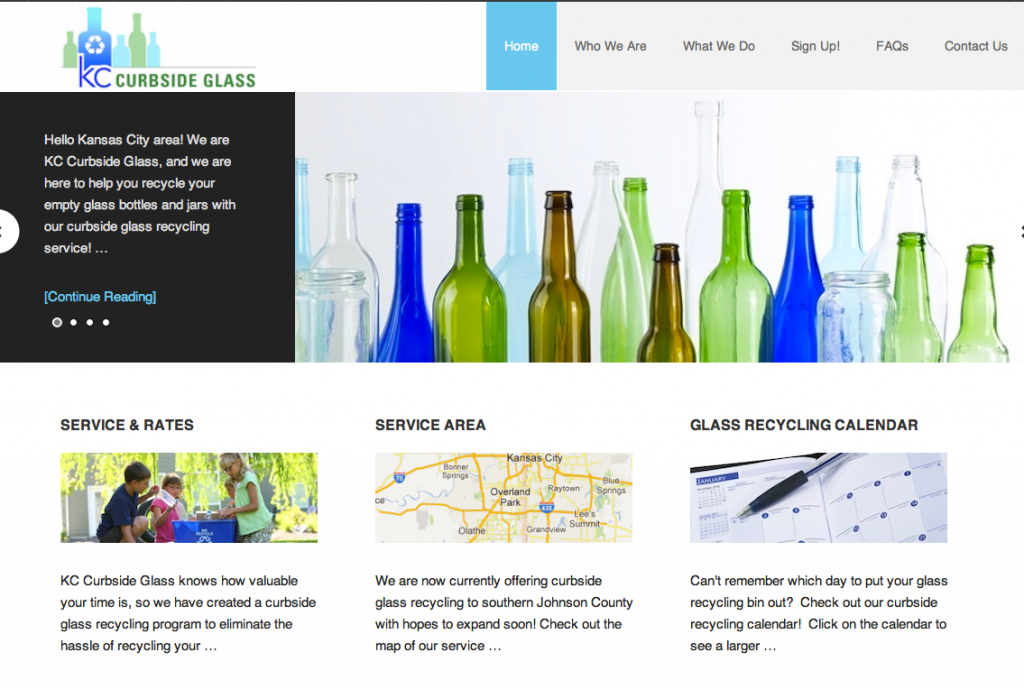
KC Curbside Glass
Cool Change NC
A year after initially building the site, we did some cosmetic updating. We integrated his new logo, modified the marketing copy and fine tuned the SEO.
Previous Look:
 This small business website needed to convey both professionalism and friendliness. Due to the intense competition in the HVAC market, this site needed to have very strong SEO to rank on Google but also be user friendly to appeal to visitors.
The magazine style site features a slider, a blog, contact forms, double navigation, and drop down menus. In addition, the front page is widgetized, meaning it’s different than the rest of the pages within the site.
The project involved complete content development including image searches.
Personal Blog Web Design
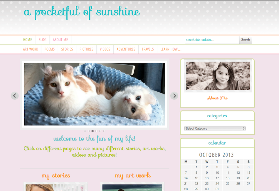
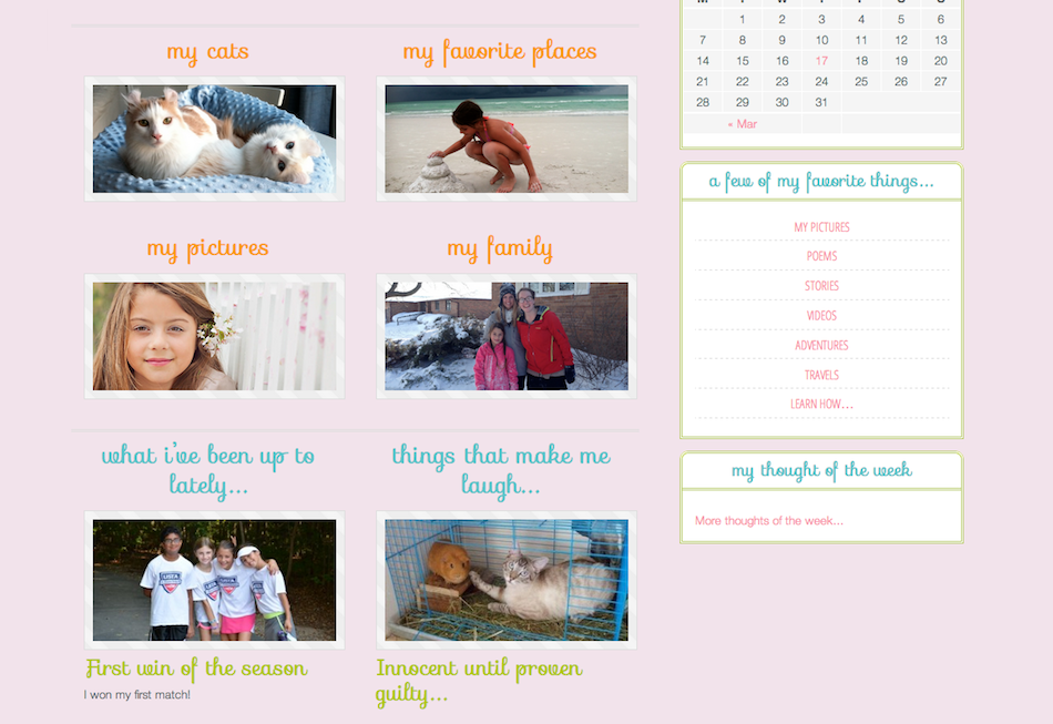
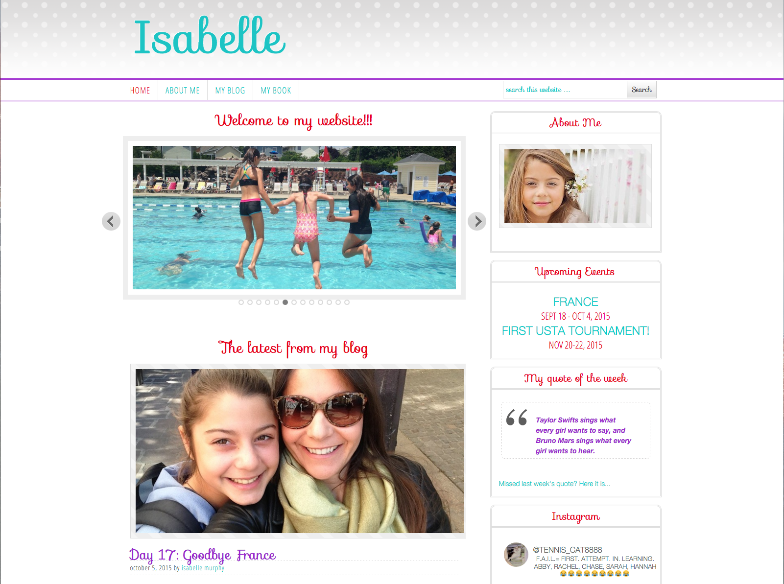
This personal blog was designed for my daughter to record her adventures. We integrated fun colors, whimsical fonts, a slider, videos, and double navigation initially. Over time, the site colors and layout evolved to reflect her growing up.
(For the safety reason, the blog has been set to “private” and is not accessible from this page)
bottom of homepage:
This personal blog was designed for a child to record her adventures. We integrated fun colors, whimsical fonts, a slider, videos, and double navigation. The home page is individualized.
(For the safety reason, the blog has been set to “private” and is not accessible from this page)
The Raleigh Handyman
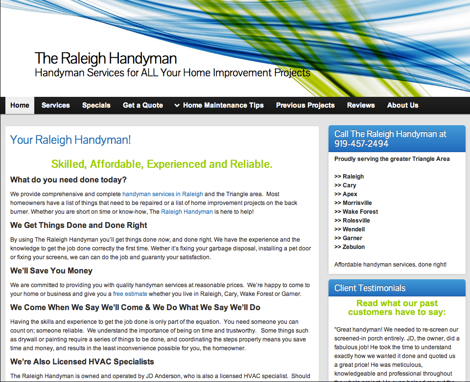
This site was done for a small business.
The site needed to be attractive and professional. It also needed to be easy to navigate, and large enough to have some weight in the eyes of search engines.
The focus on Search Engine Optimization was very heavy. The site involved full content development including image searches. It is connected to directories, social media. It includes a blog, a slider (placed at the bottom of the page to be avoid distractions), a contact form and drop down menus.


