teamworks communication
Executive Coaching
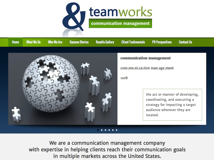
This website was a large, complex site that was completely rebuilt and revamped.
Given the nature of the business, the look needed to be sharp and professional. There was a lot of information to convey, so the emphasis was put on content. The site includes a blog, the use of an auto responder, contact forms, access to digital media, and testimonials linked directly to various social media.
The focus on Search Engine Optimization was huge in order to rank in Google under several keywords.
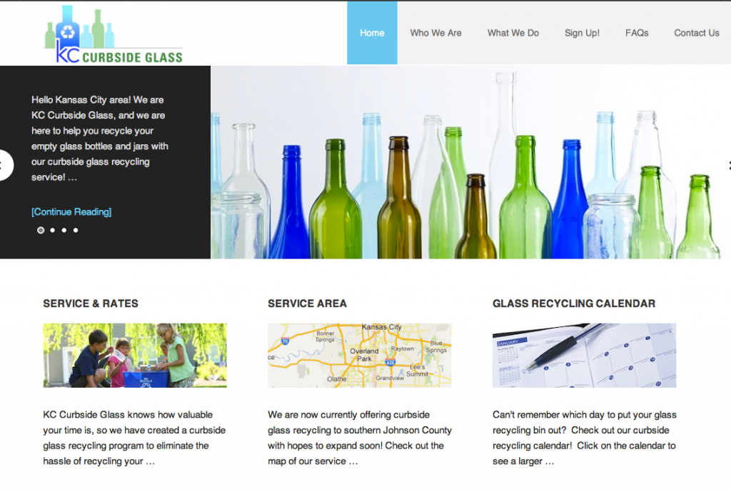
KC Curbside Glass
Personal Blog Web Design
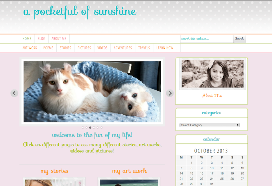
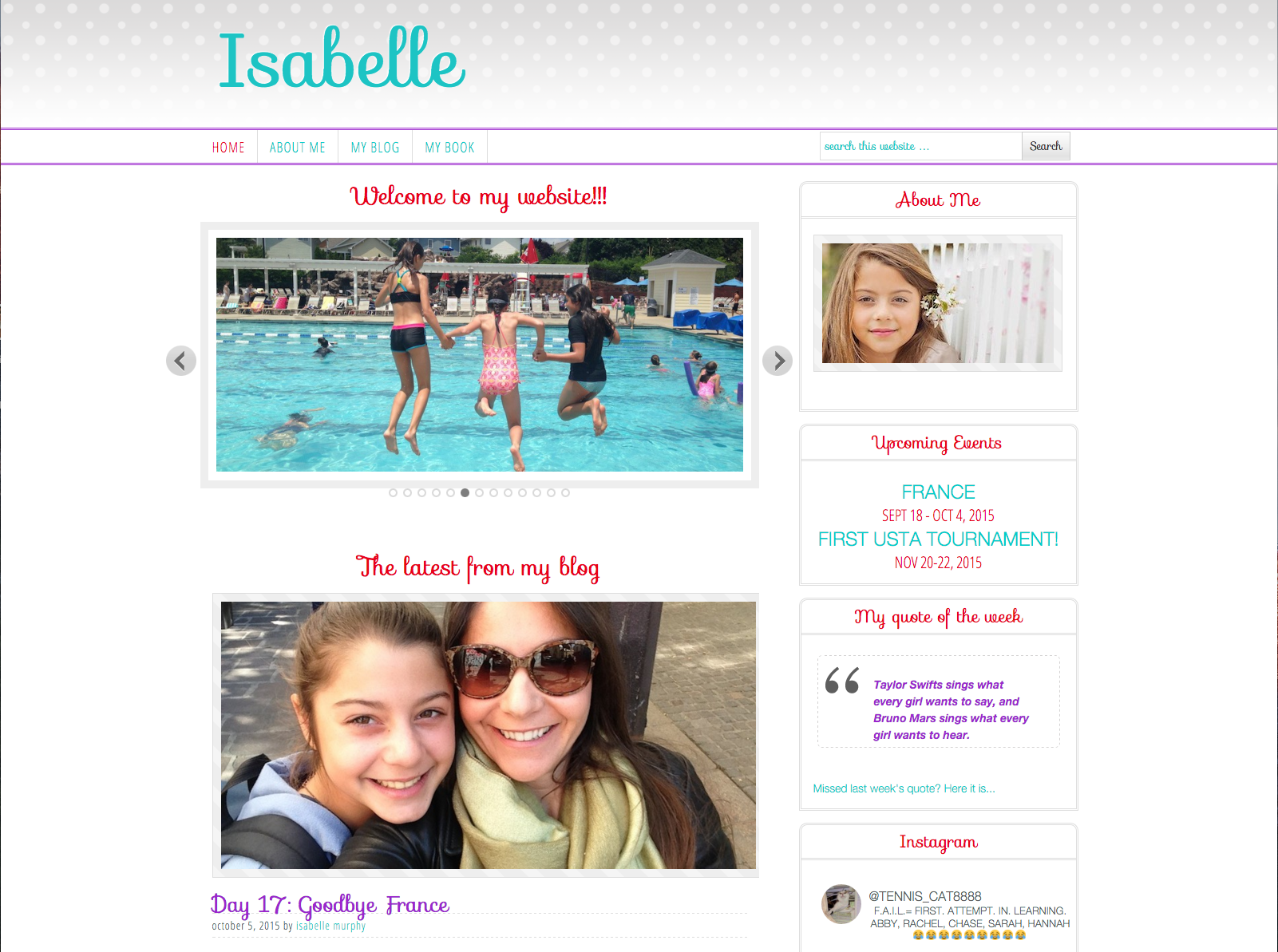
This personal blog was designed for my daughter to record her adventures. We integrated fun colors, whimsical fonts, a slider, videos, and double navigation initially. Over time, the site colors and layout evolved to reflect her growing up.
(For the safety reason, the blog has been set to “private” and is not accessible from this page)
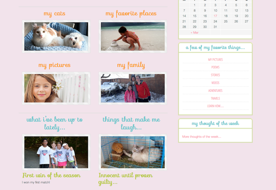
bottom of homepage:
This personal blog was designed for a child to record her adventures. We integrated fun colors, whimsical fonts, a slider, videos, and double navigation. The home page is individualized.
(For the safety reason, the blog has been set to “private” and is not accessible from this page)

